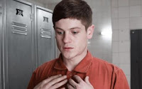
The character Gary in misfits is a typical stereotype of a rude boy, with a shaven head, rude boy cap and poor attitude towards people. He is completely obsessed with himself and is easily annoyed. He has a short temper which is lost once in the programme after getting some paint on his hat.
The character Curtis is a serious runner, who's career seems to be over after being caught in possession of cocaine. He can not take the punishment seriously, believing he is hard done by and shouldn't be there.
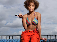
The character Kelly is stereotypically a chav, wears a lot of makeup, talks in a chav like manner and makes little rude comments throughout. She puts her orange overalls on, leaving it undone and looks in the mirror a lot, indicating her constant concern for her appearance.
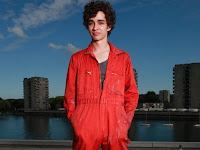
Simon is the outsider who is very quiet, he is seen as a pervert by Nathan, but says he tried to burn down a house. He puts on his orange overalls with the button up to the top which makes him look more upper class than the others. I think this shows that he is quieter than the others and doesn't really want to get into too much trouble despite apparently having attempted to set fire to a building.
Aisha is the prettier one, she talks on her phone when the man is talking and hasn't got much respect for people’s feelings. She puts on her orange overalls in a seductive way. She behaves in a provocative manner in how she talks but also shows she isn't sensitive when she says 'you screwed up big time' to the runner Curtis, which is probably a sensitive subject for him.
Nathan is the cocky, arrogant one who always seems to be talking, or trying to create a conversation by aggravating the other people. He'll make inappropriate comments, some of which personally amuse me.
I would say Nathan is the the self-appointed leader of the group doing community service.
In the second clip of Misfits, the representations of the characters have changed. Nathan in the first clip is very arrogant and self assured and has no regard for his mother's feelings, whilst in the second clip he seems like he cares more and appears to want to change. He warns her about the guy she is seeing and show her he is ready to live in his house again after being removed from his house with her.
Curtis in the first episode has got a negative attitude towards community service and feels as if he shouldn’t be there while in the second episode we watch him having fun and dancing with the elderly people showing a more relaxed side to his nature as he allows himself to enjoy himself.
Kelly becomes friendlier in the second episode because she is hurt by hearing what people think about her, she seems like she really cares what people think about her and therefore tries to change her personality for the better.
Simon the outsider seems more accepted and integrated into the group, because he makes more of an effort to socialize with the other characters. Being invisible is metaphorical for his everyday existence normally when he is extremely shy, but now he is actually invisible. He learns people need each other to survive, which is a valuable lesson for him
Aisha in the second episode realizes she doesn't like every guy thinking she is sexy after previously liking the sexual attention received before.
Near the end of the second episode of misfits you see them enjoying helping the elderly and dancing with them.
I think from the couple of clips of Misfits that I have seen, it portrays a negative stereotype of what how youth culture is in the 21st Century. Very few teenagers accurately fit that stereotype, obviously some areas have a higher crime rate than others due to the antisocial behavior of young adults. Overall teenagers the majority of young people do not behave in such an aggressive manner. I think they exaggerate each stereotype in the series, to create a more entertaining television series one can relate to.
 This task was to learn different camera shots and angles you can take.
 extreme close up shot, The shot is so tight that only a fraction of the focus of attention, such as someone's eyes, can be seen.
 Canted angle, Sometimes the camera is tilted (ie is not placed horizontal to floor level), to suggest imbalance, transition and instability (very popular in horror movies).
  Low angle shot, These increase height (useful for short actors like Tom Cruise or James McAvoy) and give a sense of speeded motion.
  High angle, The camera is elevated above the action using a crane to give a general overview. High angles make the object photographed seem smaller, and less significant (or scary).
  P.O.V point of view, Shows a view from the subject's perspective.
 Long shot, This is the most difficult to categorise precisely, but is generally one which shows the image as approximately "life" size ie corresponding to the real distance between the audience and the screen in a cinema. This category includes the FULL SHOT showing the entire human body.
 Mid shot, Shows some part of the subject in more detail while still giving an impression of the whole subject..
 Close up, An extreme close-up, sometimes called a tight shot, is, as its name implies, a more extreme version of a close-up-for example, when the camera closes in on the face of a person and then comes in even closer to focus on an eye. A medium close-up emphasizes the principal subject but includes other objects that are nearby.


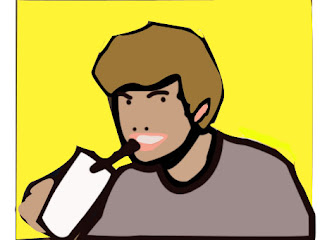 There were many different skills i used on photoshop to create this face. First i used the pen tool, which is used for creating paths, I first used the tool by clicking at a point in my hair then clicking at another point until it made the outline shape of my hair, i then did this for my face, body, hand, disposable cup and background. If you click and drag, it will change the shape of your path, allowing you to bend and shape so it fits to how you want.


