Evaluation 3


 Before we went out filming our video we shared our Initial treatment ideas with our teachers and class. Everyone seemed very positive about our initial idea's. Initially we planned to shoot our video in a warehouse, but we weren't able to get one. This worked out to our advantage, as I managed to pursuade the manager of The Junction to allow us time to shoot it on the Junction stage. Our class and teacher thought this was a better idea than the warehouse. I also managed to get The Junction lighting that is used for live performances and shows. Before we went to film our footage we planned out some of the shoot types that we wanted, and made sure that we had each others phone numbers. We also created a list of the props that we would need to bring, so that we wouldn't forget any.
We all got audience feedback on the rough cuts of our video's. This was very useful and beneficial to our video. Although we gained mostly positive feedback, which helped us know what bits to keep in, it was the negative feedback that helped most! By getting feedback from others on the rough cut I feel it has made the video more of a success, mostly because when you are analysing your own music video, you’re not going to spot as many things that are wrong. I also think that the more people that analyse it the better it will be, as the more idea's and constructive criticism you will receive!
During the process of our video people commented on the lip syncing from Doug in the perfomance on our video. Feedback told us that you couldn't see him lip sync the words properly, despite his good perfomance at The Junction. We managed to shoot it again in the dark room at college with some lighting. We mainly used close ups to shoot this, and then changed the lighting on final cut to make it seem as if he was performing at The Junction.
My digipack has changed a lot due to the feedback I received.
My digipack has changed a lot due to the feedback I received.


First I created a rough idea of what I wanted by drawing the kind of digipack I thought would look good.
I went on dafonts.com to help me find a font for the album. I downloaded a variety to keep my options open when designing the Digipack. My initial feedback from my class and teacher told me that the fonts I was using were too common, so getting a good font was a very important task for me.
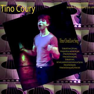
The typical pop album cover would have a picture of the artist posing on the front, and then the same at the back with the album tracks going down the page. I tried to create this with my digipack.
I wanted to have the lyrics to our song in my digipack, and decided to use the 3rd panel of my digipack for this.


Most of the feedback I got from my facebook page wasn't useful, with comments such as 'it's good' or 'looks professional, I like it'. Some feedback however was useful, such as the purple I used in the coloring being 'a bit in your face'. After receiving this feedback I tilted the purple on photoshop so it was less in your face. I also completely changed my third panel as the feedback told me it was too similar to the other two panels. I experimented with moving around logo's and the writing on the back cover, but my teacher and class mates said it looked best in its original position, as it didn't fit into other places as well. The black sound hole of the guitar almost looks as if it could be a CD.

No comments:
Post a Comment