Friday 8 April 2011

Final Video, Digipack and Advert.


Back Cover


Front Cover


4th Panel, CD fits in the middle.


3rd Panel, lyrics to 3 Chord Love Song.


My magazine advert.

Thursday 7 April 2011

Evalution task 1


. a 1. This shot was taken right at the beginning of our video, showing the artist writing the love song whilst sitting at the side of the stage. I think this shot shows a strong link between the lyrics and story line of the song, as it is titled '3 chord love song'. 


2. I chose this shot as the artist is wearing a suit looking very smart, not smiling, yet looking relatively happy.  I think the record company would want their artist to be represented in this way. The record company would also want to represent their artist as a young pop star, perhaps less manufactured as other male artist around, as the still photo shows him writing his own song. The shot was taken on a stage to help illustrate that he is a popular artist and well-known; a record company would want to emphasise this information to help increase the number of fans. This information should hopefully attract male fans as well as female.  


3. I chose shot 3 as it illustrates the genre pop. It's a very cheesy pose with lighting in the background. Pop is a cheesy genre and this shot has the artist pointing out to the audience saying that he is writing the love song for them, or for an individual in the audience. The artist is wearing a tight top and blue chino like jeans, which modern day male pop stars tend to wear. 


4. I chose this shot because I think it shows an intertextual reference to the film The Notebook. Our narrative has a love triangle between Holly, Scott and Tino Coury.  In our story line Holly chose to leave her boyfriend for Tino Coury. The shot shows this by Holly looking angry and ripping up a photo of her boyfriend (ex). The film The Notebook is about a girl choosing between two guys, which is like our story. 


5. We used many different camera angles while filming our video. I came up with the crane idea, which is demonstrated in picture 5. To obtain this shot we placed a ladder on stage, climbed it, and then picked up the tripod with the camera attached to create the height and overhang needed for the crane effect. 


6. I like this shot of the lighting in our video, as at this stage it doesn't have Tino Coury in, but then the camera pans around to Tino again. It demonstrates our use of lighting well. I think the lighting was a big strong point in our video. We used blue lighting for the verses, changing for brighter lighting in the chorus in order to create different mood changes in the song.  


7. I think this shot demonstrates our use of mise-en-scene well. The perfomance side of our video was shot on stage at the junction. We used many props when filming, such as an Ipod, costume changes and lighting. 


8. Shot 8 helps to illustrate that we have watched many other music videos to support our ideas. The lighting we used and the low camera angle shot make the artist seem more important. 


9. Shot nine shows Holly crying. We had seen other music videos that included a story line with tears, and we thought that by including this, the video would be more dramatic and the story line more effective. Stop Me by Mark Ronson is an example of a music video that includes a storyline with a girl crying.


My product used many conventions of real media products, for example my digipack used themes from the pop genre. I matched the conventions by using images of the artist posing with colouring effects to create that pop feel. I used my third panel on my digipack to relate to the music video by having the lyrics to the song and a picture of the artist singing.


1. this is a shot from Katy Perrys video firework, it shows a link between the visuals and the lyrics as the lyrics are 'baby you're a fireowork' and there is a firework going off in the video as she sings this. 
 2. This shot is from Matt Cardles video 'When We Collide'. The video is mainly performance based with edits from his best bits on the show 'X Factor'. We also just had our artist on a stage, similar to the one Matt is performing on. He is dressed smartly playing guitar which suggest that the record label would want the artist to be represented as less manufactured as other pop artist these days to attract a wider audience. 
3. This shot is from JLS's video 'One Shot' which is also mainly perfomance based. They use similar lighting to the lighting we used during the verses (but not the chorus) part of our video. I think the lighting used represents the genre pop well, in the video JLS are all singing with a few dance moves on stage which i think also reflects the pop genre as many pop video's are like this. 
4. Justin Beibers video 'Somebody to love' has two artists in the same location, a bit like our video when Doug comes on stage with Tino Coury for the rap part in our song. In the video they show an intertextual reference to many other video's but reminds me a lot of michael jackson videos with his dancing. 
5. In this shot it has the band JLS under a spot light. The camera angle used is a long shot so you can't make out the faces of each member of the group or even that it is JLS, despite this you know it is them. We also used some long shots in our video. 
6. In this video of Peter Andre they use a blue tone lighting showing the outline of Peter Andre which i think looks very effective. We used this kind of lighting in our verses and changed the lighting to more upbeat colours in the chorus. 


7. This is a shot from Lady Gaga's video 'Born This Way' which is think shows a good use of mise-en- scene. The video is very weird and abstract but in the particular shot it has people dressed in simple clothing standing around a mysterious figure(possibly gaga). In the day of shooting our video i brought 3 different outfits but only ended up using two of them. 


8/9 This shot shows the songs emotion with Peter Andre's hand movements, i tried to create a similer effect in our video. We were not heavily influenced by any one individual video but a cross section of the pop genre helped us create our final product. 

Evaluation 1 - other pop music video's.


1. This is a shot from Katy Perrys video 'Firework'. The video shows a link between the lyrics, as when she is singing 'baby it's a firework' fireworks are going off in the background.


2. This is an old Britney Spears video, it shows her wearing white, smiling a lot, and dancing near the beach. I think the record company wanted Britney to be represented in this way at the beginning of her career. She has an innocent, sweet and pretty look about her that would attract particularly younger male and female fans. 


3. This is a shot from the video 'Raining Men'. I think the video illustrates the genre pop very well, as most pop video's include a dance of some kind. In this video it has a lot of people jumping about dancing and having fun. 

4. I think the film High School Musical shows an intertextual reference to Geri Hallywells video 'Raining Men' as it has a lot of people dancing about, having fun, jumping about and singing. 


5. 
I think that the shot in JLS's video 'One Shot' shows a good use of camera work. It shows the full band under one spot light posing. Even though you can't see their faces, you know that it's them. 


6. I think this shot from Peter Andre's video 'Defender' shows a good use of lighting; it's the kind of lighting we used in the verses of our video. 


7. 
In the video Paparazzi Lady Gaga has many good uses of Mise-en-scene. I think this shot shows good use of that with the gloves she is wearing. 


8/9 Alexandra Burke's video 'Start Without you' is very similar to other music video's with that style of music. It has the same theme as the video 'Get Outta My Way' by Kyle Minogue, with all the topless gym guys dancing around her.

Evaluation task 1. Magazine Advert and Digipack

I created this on photoshop, it shows conventions between my album advert and other album adverts. 
My advert, in a similar way to professional album adverts,  highlights stores such as hmv where the album can be purchased, as well as internet sites where it can be downloaded from, such as itunes and amazon. The adverts all have pictures of the artist on and this is the main attraction of the advert. My advert has a large picture of me (Tino Coury), another example of a convection I have used with the album advert. 


All the album covers here have a picture of the artist posing with the artist name and album name written on. 
I particularly think the conventions of these two album covers resemble mine. In the Jesse Maccartney album he is sitting down in a similar pose to mine; he isn't smiling but he doesn't look sad. Perhaps he looks like he is deep in thought, a bit like the picture I have as my cover? The same goes for the expression on Micheal Buble's album. In Michael Bubles album they use a different colour and font for the artist name and album name; I have done that with mine too. I tried to make the artist name look more personal with a hand written kind of font. 
Unfortunately I couldn't find any third panels or extra panels from pop albums on google or other websites so I went through my stash of old albums, but quickly realised that I didn't own any pop albums! In my Rage against the Machine and Early Strokes album however, I noticed that the bands website and lyrics were used as their third panel! I decided to do the same, using both lyrics and website as my third panel. 
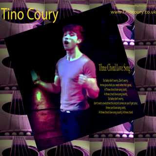
I think this album cover of Micheal Buble is in many ways similar to my extra panel, as it is showing the artist perfoming.


I managed to find a few back covers of pop albums on google; the conventions of these are similar to mine. They all include a bar code, a picture of the artist and in print the record label that helped release the album. The album tracks are listed a bit like the ones listed in the Justin Beiber album, going down the side of the page.  


My product used many conventions of real media products. My digipack, for example, used themes from the pop genre. I matched the convections by using images of the artist posing with colouring effects to create that pop feel. I used my third panel on my digipack to relate to the music video by using the lyrics of the song and a picture of the artist singing.

Tuesday 5 April 2011

Evalution task 2


We completed our ancillary tasks before shooting our music video and decided that I was going to be the main performer. This meant that I had to have a photoshoot for our digipacks to get appropriate pictures in the style of male pop stars. Both our music video and digipack has the artist throughout. This also links to my album promotion poster which has an image with the artist on. It is common for artists and bands to look directly into the camera when posing for an album cover or advert. This usually gives them a more aggressive feel.  In contrast, in my advert and digipack we deliberately didn't have me looking at the camera, in order to show that the artist had a sensitive side. 
I did a lot of research into pop music, pop album covers, and male pop artists that sound similar to 'Tino Coury'. Mainly all pop album covers have a picture of the artist on the front, and usually a midshot close-up of them posing. I thought about the target audience when completing the digipack, and in the end I decided that mainly teenage girls would be targeted. We focussed on this target audience when creating the digipack, promotion poster and music video. By looking at my digipack the audience would be able to tell that the cd and music video were genre pop. When you open my digipack up the third panel has a picture from the video in. With the other images used you would be able to tell it was from our music video. 


I got feedback from other students on whether my digipack and music video worked well together. Feedback told me that they fitted well together, both giving out a male pop star theme and a sense of emotion through out the video and digipack.

Monday 4 April 2011

Evaluation task 3


Evaluation 3

Before we went out filming our video we shared our Initial treatment ideas with our teachers and class. Everyone seemed very positive about our initial idea's. Initially we planned to shoot our video in a warehouse, but we weren't able to get one. This worked out to our advantage, as I managed to pursuade the manager of The Junction to allow us time to shoot it on the Junction stage. Our class and teacher thought this was a better idea than the warehouse.  I also managed to get The Junction lighting that is used for live performances and shows. Before we went to film our footage we planned out some of the shoot types that we wanted, and made sure that we had each others phone numbers. We also created a list of the props that we would need to bring, so that we wouldn't forget any.

We all got audience feedback on the rough cuts of our video's. This was very useful and beneficial to our video. Although we gained mostly positive feedback, which helped us know what bits to keep in, it was the negative feedback that helped most! By getting feedback from others on the rough cut I feel it has made the video more of a success, mostly because when you are analysing your own music video, you’re not going to spot as many things that are wrong. I also think that the more people that analyse it the better it will be, as the more idea's and constructive criticism you will receive! 

During the process of our video people commented on the lip syncing from Doug in the perfomance on our video. Feedback told us that you couldn't see him lip sync the words properly, despite his good perfomance at The Junction. We managed to shoot it again in the dark room at college with some lighting. We mainly used close ups to shoot this, and  then changed the lighting on final cut to make it seem as if he was performing at The Junction.


My digipack has changed a lot due to the feedback I received. 


First I created a rough idea of what I wanted by drawing the kind of digipack I thought would look good. 

I went on dafonts.com to help me find a font for the album. I downloaded a variety to keep my options open when designing the Digipack. My initial feedback from my class and teacher told me that the fonts I was using were too common, so getting a good font was a very important task for me.
The typical pop album cover would have a picture of the artist posing on the front, and then the same at the back with the album tracks going down the page. I tried to create this with my digipack.

I wanted to have the lyrics to our song in my digipack, and decided to use the 3rd panel of my digipack for this.


I think the idea of having the guitar panel as the cd panel was creative as the CD fits inside. 
Most of the feedback I got from my facebook page wasn't useful, with comments such as 'it's good' or 'looks professional, I like it'. Some feedback however was useful, such as the purple I used in the coloring being 'a bit in your face'. After receiving this feedback I tilted the purple on photoshop so it was less in your face. I also completely changed my third panel as the feedback told me it was too similar to the other two panels. I experimented with moving around logo's and the writing on the back cover, but my teacher and class mates said it looked best in its original position, as it didn't fit into other places as well. The black sound hole of the guitar almost looks as if it could be a CD.

- Third Panel


- Front, back and CD panel. 
                                                                                                                                 

Sunday 3 April 2011

Evaluation task 4 Prezi


Evalution task 4

During the process of the construction of our product, we used a large range of media technologies.

We used an HD camera to shoot our video which didn't belong to the college, in order to make sure that we knew where all the footage was kept and no one would over ride it. During filming we used a tripod at times to keep some of the angles steady and balanced. Keeping the shots balanced was important for some angles, such as the mid shot, but I think the best shots were hand held such as the crane angle shot. The footage took a long time to import into the apple mac laptop after shooting. While filming we also used an ipod to play the song, so that I could lip sync with different kinds of lighting for both the chorus and verses. When it came down to the research and planning of our product, I used various media technologies some of which were helpful, and others not so much. Google was the most useful along with wikipedia. Youtube was also very very useful as it allowed me to look at many other music video's for inspiration and helped us a lot over the course of creating our product. After I managed to secure The Junction to shoot the performance side of the video, we decided to make our music video mainly performance based, with only a little narrative. When we got feedback though, people said that our story line didn't make complete sense, so we decided to shoot some more footage in the black room at college, to add more narrative. Feedback told us that this worked well. 
We then edited this on Photoshop, where we could tilt the colours of our images to make them more eye-catching.

Friday 1 April 2011

Construction, extra panel digipack

Experimenting again with the extra panel after getting feedback from some friends and family members i had the idea of putting the background from the cd panel as the background to my extra panel so that the panels fit together, here is what i have come up with. I had to change the purple text to yellow but i think i like that as it's brighter and stands out more.

Construction, Digipack reflexion

I think my digipack accurately represents our video and vise versa. In the digipack i am sitting posing on the front and back cover, this is like our final video shot at the junction as through out the video the artist(me) is posing throughout the song with the emotion of the song. I think the extra panel in my digipack really resembles what we have done in our video as it is dedicated to the song 'Three Chord Love Song'
My original idea was to get a picture from the video of Tino Coury wearing the suit writing the love song, but i just thought an image of him singing the song would suit the style of the digipack more. The clothes he wears in the video suits what he is wearing in the front and back cover. Both the video and digipack appeals and targets the same audience, pop lovers, girls and perhaps a gay male audience with the tight t-shirt and poses on the front/back cover. I decided to change where the lyrics are on the extra panel as the black background made them stand out more and therefor making the lyrics look more professional.
I think all the panels work well together now, even the extra panel which is doesn't have a purple background like the other panels. The T-shirt i am wearing is almost the same colour as the other panels in my digipack.

Wednesday 30 March 2011

Construction, Colour changing Digipack

I've recently made all the panels in my digipack a touch less purple as in my feedback they mentioned about the purple being quite in your face. Here is what i have done. Although purple can be seen as a 'girly' colour i think it suits the artist and will appear to the ladies wanting to buy the album.
I've been playing around with where i put the record label logo on the back cover but people have said it looks best where it is when i've tried other places.

Extra pannel latest, i can't get the colouring right for it to fit with the other panels made.


 I like this design for the extra pannel, i used a neon effect on photoshop to create the background. This could be my final design 

Tuesday 29 March 2011

Construction, Planning for the Digipack

After getting feedback on the digipack i've been playing around with the colouring a lot trying to get the right colour for my album as that was the main issue raised. My feedback told me to make the purple a bit less in your face and also change one of the images as all 3 are samey. I have decided to use an image from the video on my Digipack.
 I got told that my font was great so i will stick to the font i have. I'm not totally keen on what i have done as i think the colours used are a bit too 'hot' and a very bog contrast compared to the purple i used to have on the panel.
Despite some issue being raised over the yellow coloured font i like it, i have been trying other colours for fonts such as blue and red but they both didn't work with my images. I think yellow is the best colour for the font on my digipack.

I have also been playing around with my third panel as in the feedback they mentioned changing the last image used as it is samey to the other two on the back/front cover of the digipack.
This is what i have come up with for the third panel.
I quite like the colour of the darker panel here, i decided to use an image from our video as the third panel has lyrics from the song on and it makes sense to have a picture from the video on that panel.


Saturday 26 March 2011

Planning, Construction, Research. Sharing our final video with Tino Coury and his fans


We decided that we wanted Tino Coury's opinion on our music video. To do this we searched him on google, facebook, twitter etc to find sites on him. 


Tino Coury's official site was useful as it had all the links to all we pages to do with him. 


In the end we decided to choose '' to tweet to as they seem to tweet more often compared to the other twitter pages of 'tinofanpage' whose last update was all the way back on the 9th of January.
We also posted a video reply on the most viewed video on youtube for 'Three Chord Love Song' which will link back to our final video. 

Media_httpgyazocome31_dtbec
The video will appear beside their video if they choose to accept our video response.
I'll be posting our video on Tino Courys myspace page later.